
What Is Market Microstructure and Why Most Traders Ignore It
A practical introduction to what happens beneath price — in the order book, in aggressive trade flow, and in the behavior of large market participants.
Most traders watch price. Professional traders watch behavior.
If you have been trading crypto for any length of time, you already know that price alone does not tell you the full story.
You have probably had this experience: you see a clean setup on the chart. Everything looks right. You enter. And then the market does something that makes no sense based on what the candles were telling you.
What happened?
In many cases, the real explanation was developing beneath the price — in the order book, in the flow of large trades, and in the behavior of participants you could not see on a standard chart. This is what market microstructure is designed to reveal.
What Is Market Microstructure?
Market microstructure is the study of how trades actually happen — the mechanics behind every price print you see on a chart.
It asks questions that a candlestick chart cannot answer:
- Who is buying and who is selling?
- Are buyers being aggressive — crossing the spread to execute immediately — or are they sitting passively in the order book waiting?
- Is the order book supporting the current price level or resisting it?
- Are large participants accumulating, distributing, or simply making noise?
- Are Binance and Bybit showing the same picture, or is there a meaningful divergence between the two exchanges?
These are not theoretical questions. They have practical answers — answers that are visible in real market data if you know where to look.
From Concept to Practice
This is where market microstructure becomes practical.
Instead of looking only at candles, we can look directly at large aggressive trades.
In the chart below, each bubble represents a BTCUSDT whale trade above $200,000. Color shows buy-side versus sell-side pressure, and bubble size shows notional value.
This reveals something a normal chart cannot: when large participants are active, how concentrated that activity is, and whether buying or selling pressure is dominating key parts of the move.
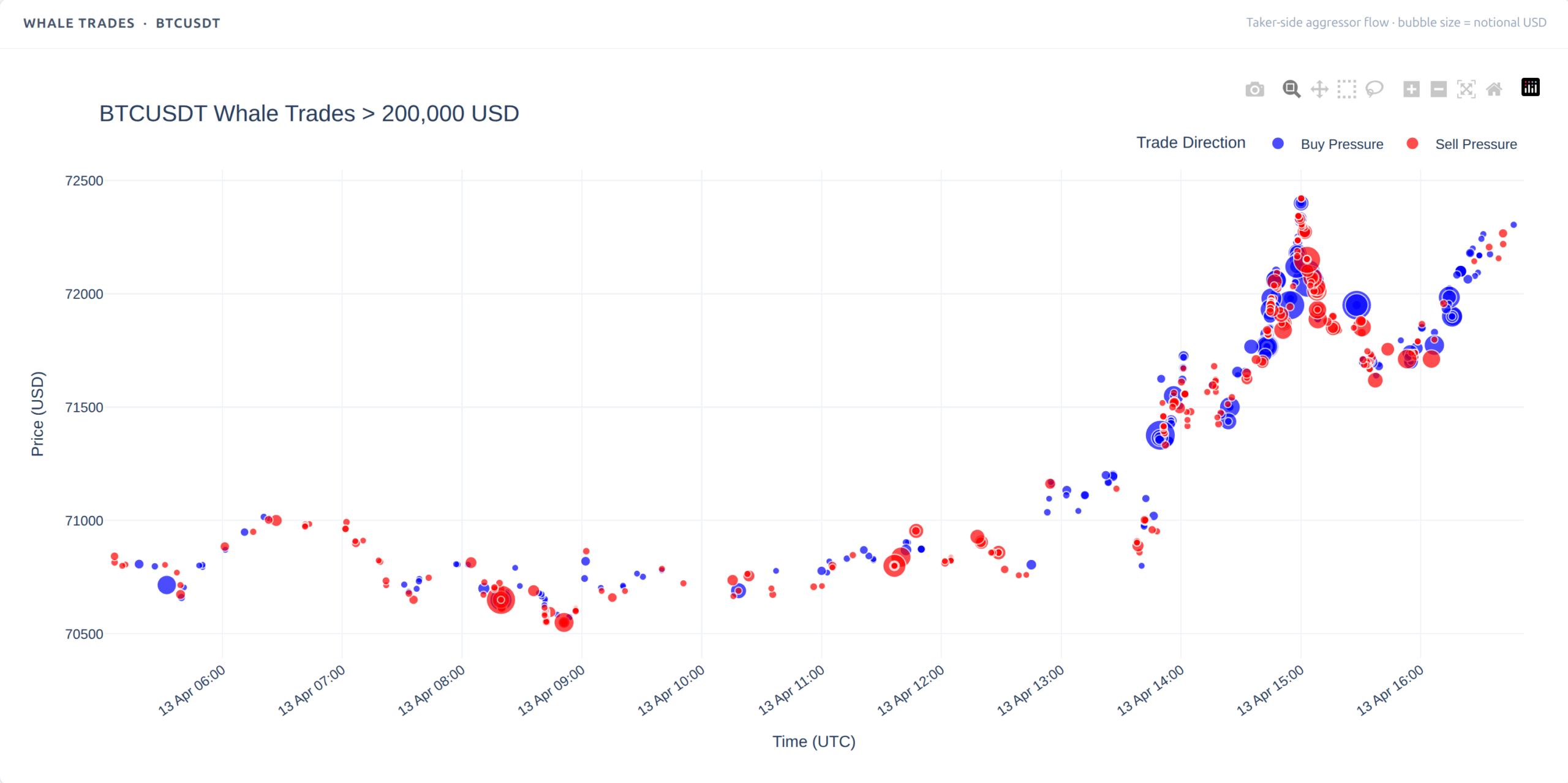
Chart 1. BTCUSDT whale trades above $200,000. Bubble size shows notional value, while color highlights buy-side and sell-side pressure. Available on all plans including Free – try it now at bigtrades.innosoft.ai
The Two Layers Every Trader Should Understand
Layer 1 — Executed Trade Flow
Every time someone places a market order, they are crossing the spread and executing immediately against whatever liquidity is sitting in the order book. These are the aggressors — the buyers and sellers who are willing to pay the current price to get their position filled right now.
Large executed trades — what we call whale trades — are particularly meaningful. When a participant executes $200,000 or $500,000 or $1,000,000 in a single aggressive buy, they are making a statement about their conviction. They are not waiting for a better price. They want in now.
Tracking this flow — who is aggressive, how large, in which direction, over what time frame — gives you a real-time picture of where conviction sits in the market.
This is where flow imbalance becomes useful. Instead of looking at isolated large trades, we can aggregate aggressive buying and selling over time and ask a better question: is large-trade activity persistently one-sided, or is it balanced and noisy? A rolling flow imbalance chart helps answer that. When the line stays strongly positive, aggressive buyers are dominating. When it stays negative, aggressive sellers are in control. What matters is not just one whale trade, but whether pressure persists.
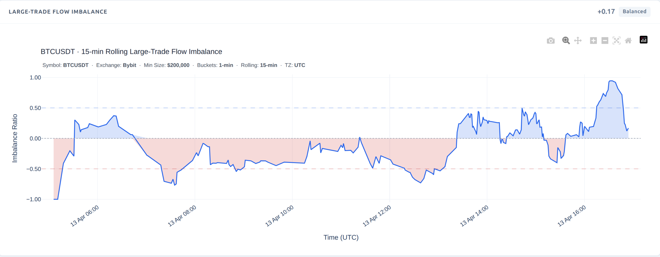
Chart 2. BTCUSDT 15-minute rolling large-trade flow imbalance. Persistent positive readings indicate sustained aggressive buying, while negative readings point to sustained aggressive selling. Available on all plans including Free – try it now at bigtrades.innosoft.ai
Layer 2 — Resting Order Book Liquidity
The order book shows you what is waiting. Bids are buyers who have placed limit orders and are sitting at specific price levels. Asks are sellers doing the same.
The structure of this resting liquidity tells you a great deal about the near-term supply and demand environment. A heavily bid-side book suggests buyers are defending a level. A heavily ask-side book suggests sellers are capping upward movement. A large concentrated order at a single price — what traders call a wall — may act as temporary support or resistance.
Executed flow tells you who is hitting the market now. The order book tells you what is waiting nearby. If aggressive trade flow shows current pressure, resting liquidity shows the structure that pressure is pushing against.
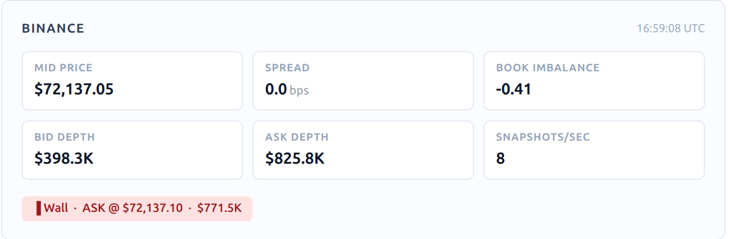
Chart 3. Binance order book snapshot for BTCUSDT. Bid depth, ask depth, imbalance, and visible wall detection help reveal the short-term liquidity structure around price. Available on Basic and Pro plans – upgrade at bigtrades.innosoft.ai
The most important insight in microstructure analysis:
The strongest signals occur when both layers agree. When you see aggressive buying and a bid-heavy order book at the same time, that is a high-conviction long environment. When aggressive selling meets a wall of bids that fails to hold, you may be watching the beginning of a breakdown.
Neither layer alone is enough. Both together tell a story.
Why Most Traders Ignore This
The honest answer is that this data has historically been difficult to access and even harder to interpret in real time.
Most retail trading platforms show you price, volume, and indicators derived from price. They do not show you order book depth over time. They do not track whale trade flow. They do not compare Binance and Bybit simultaneously. They do not calculate whether the current buying or selling pressure is statistically unusual or simply normal market noise.
This is why microstructure analysis has traditionally been the domain of institutional trading desks and quant funds — organizations with the infrastructure to collect, process, and display this data in a usable form.
What the ISG Dashboard Shows
Over the past several months, we built the ISG Dashboard — a live analytics platform designed to make this data accessible and interpretable for traders and analysts who are serious about understanding market behavior.
The dashboard brings these layers together in one working view:
- Whale trade flow across Binance and Bybit — large aggressive trades visualized in real time, with bubble size representing notional USD value and color representing buy or sell aggression.
- Order book depth and imbalance — live snapshots of the top bid and ask levels, spread, book imbalance ratio, and visible wall detection.
- High Conviction Matrix — a combined view that crosses trade flow imbalance with book imbalance to identify strong long, strong short, absorption, and exhaustion conditions.
- Z-score strategy signals — a statistical view of whether current buying or selling activity is unusual relative to recent baseline behavior across both a 15-minute burst window and a 60-minute regime window.
What Absorption and Exhaustion Mean
Two of the most important — and most misunderstood — concepts in order flow analysis are absorption and exhaustion.
Absorption happens when aggressive buyers are met by a heavily ask-side order book. Buyers are active, but sellers are absorbing that buying pressure through large resting ask orders. The result is often a stall or a reversal — buyers run out of steam before price can move meaningfully higher.
Exhaustion is the mirror image. Aggressive sellers are met by strong bid-side support. Sellers exhaust themselves against a wall of bids and eventually run out of supply. Price often stabilizes or reverses upward.
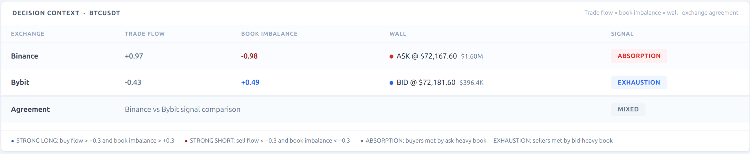
Chart 4. Decision context view for BTCUSDT across Binance and Bybit. Trade flow, book imbalance, visible walls, and exchange agreement combine to classify whether the market is showing absorption, exhaustion, or a mixed signal. Available on Basic and Pro plans – upgrade at bigtrades.innosoft.ai
This Is Not About Perfect Signals
I want to be direct about something.
Market microstructure analysis does not give you certainty. No tool does. Markets are probabilistic environments, and anyone who tells you otherwise is selling you something you should not buy.
What microstructure analysis gives you is a more structured, more evidence-based way of asking the right questions before you make a decision. It helps you understand whether the market is giving you a high-conviction setup or a mixed, unclear picture.
And that is really the point. The challenge is not only getting access to this data. The challenge is learning how to interpret it in a structured way — how to combine trade flow, order book context, exchange agreement, and statistical signals into a decision process you can trust.
What Is Next
That is exactly why we created our program, Crypto Market Microstructure and Order Book Analysis.
It is a practical, live-dashboard course designed for traders and analysts who want to move beyond indicators and learn how to read what is actually happening beneath the surface of price.
In the course, participants learn how to interpret aggressive trade flow, order book structure, absorption, exhaustion, cross-exchange confirmation, and statistically unusual behavior using real Binance and Bybit market data.
The founding cohort is limited to 12 participants. If you are interested in joining or would like a demo of the ISG Dashboard, send me a direct message or comment below.
The market is always speaking. This course teaches you how to listen.
Share Your Feedback
If you have explored the dashboard or work with order flow analysis, I would be very interested in your feedback. What would be most useful to you next: support for additional exchanges, more symbols, custom alerts, additional order flow indicators, or other improvements? Please drop a comment below.